
Some of the best moments in LA Kings’ history have taken place wearing the silver and black. Championships were won and jerseys were retired. But, the original “Forum blue” and gold colored jerseys worn by the Kings from 1967-1988 are easily some of the best looking in NHL history. And if the hype of the Reverse Retros from 2020 told us anything, it’s time for a switch back.
As much as fans can admire the memories created by the team donning their current silver and black jerseys with the “home plate” shaped crest, they never felt quite…cool. The minimalistic color scheme is dull, and the logo is mediocre at best.
In a recent poll done by @JFreshHockey on Twitter, hockey fans across the nation gave their thoughts on how they feel about the Kings’ home uniforms. And for the second year in a row, LA’s home sweaters ranked 26th in the NHL.
Here are the results of the 2022 NHL Home Uniform Survey
⬇️⬇️⬇️ pic.twitter.com/Dri8MExZjX
— JFresh (@JFreshHockey) September 2, 2022
Luckily for the team, they’re in a perfect position to make a change. A new chapter of LA Kings hockey is quickly starting to materialize. Admired players who’ve worn the current threads like Jeff Carter, Jake Muzzin, Justin Williams, Jarret Stoll, and now longtime captain Dustin Brown are all gone. And stars like Phillip Danault, Trevor Moore, Sean Durzi, Arthur Kaliyev, and Quinton Byfield are writing their own story.
Brief history

1967-1988, “Forum blue” and gold era
After original owner Jack Kent Cooke used a fan contest to find the name “Kings,” he then decided the team’s colors would be purple and gold, a palette associated with royalty. The purple was officially called “Forum Blue” (Cooke hated the name purple) to match the home in which the Kings played.

1988-1998, Gretzky era
Just in time for the “Great One” to arrive in 1988, the Kings made a change to silver and black. Owner Bruce McNall made the switch hoping to win over the admiration LA sports fans had for the Raiders’ color scheme at that time. Coming along with the color switch was a new “chevy” shaped logo.

1995-1996, The Burger King jersey
Whether it was the gradient sash, the purple colored numbers, or the strange logo, the “Burger King” jerseys worn during the 1995-96 season didn’t work. Since then, however, the sweater has grown a cult following, being embraced for its ghastliness.
1998-2011, A new purple and crest emerges
Color was officially back on the LA Kings home and away jerseys when the purple-silver-white scheme was adopted in 1998. The team felt it was time to ditch the black and silver due to the colors being associated with gang representation. Two different logos were used around this time. A new crown had emerged along with a new crest.
The jerseys used at that time were…alright. They weren’t the best. But this era did introduce us to the sunglasses-clad lion.

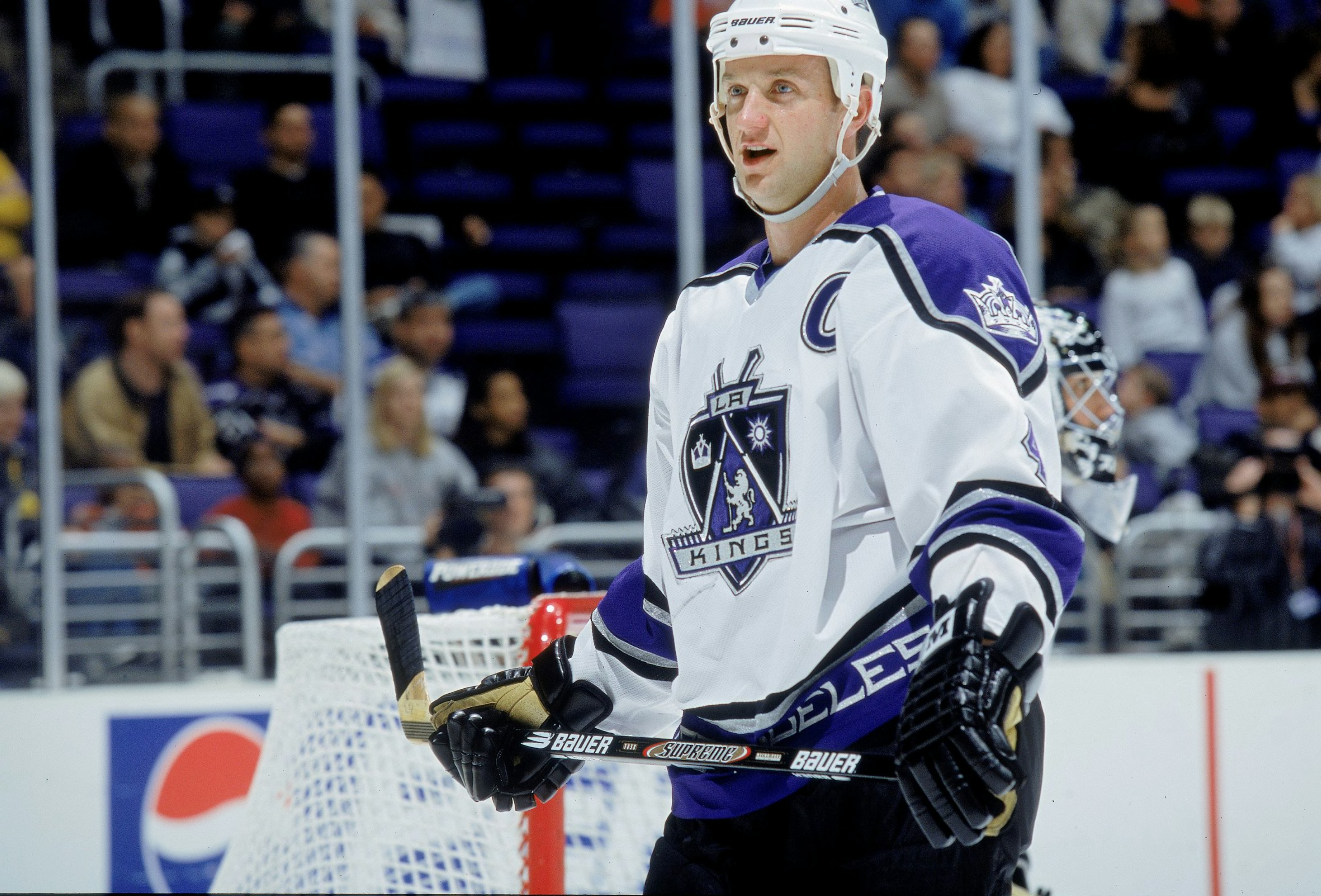
2011-Present, Back in black with the “home plate” logo
The silver and black was back as the LA Kings’ main color combo in 2011. And it’s pretty much the same jerseys they wear today. The uniform features a “home plate” shaped logo in front with the letters “LA” across the top and a crown below.
Jerseys and logos were somewhat an afterthought around that time, though. As the team would win its first two Stanley Cups in the first three years wearing their new uniforms.
An LA Kings original.
The silver and black will always live on in LA Kings’ history. Even though I admire the current alternate jerseys giving homage to their 90s era, it’s time for the Kings to go back to their roots. The “Forum blue” and gold mix is considered one of the most iconic color schemes in sports history. The Lakers may have made it popular, but the Kings wore it first.
The color combination made its debut on October 14, 1967, when the LA Kings played their first game at the Long Beach Arena (construction of the Forum had not yet been completed). Three days before the Lakers debuted them on the hardwood.
Legendary players, including Rogie Vachon and Marcel Dionne, donned the “Forum blue” and gold in all its glory. And miraculous moments, including the “Miracle on Manchester,” took place in Jack Kent Cooke’s original color combo.
After purchasing the LA Kings from then-owner Jerry Buss in 1987, Bruce McNall made two big moves, changing the colors to silver and black, and acquiring the best player in all of hockey. Since then, fans have waited patiently for the team to make a permanent switch back.
The Reverse Retros weren’t around long enough.
When Adidas unveiled the Reverse Retro jersey designs in 2020, LA’s was easily one of the best. The Gretzky era logo mixed with the “Forum blue” and gold was a *chef’s kiss*. Fans were obsessed. They were utterly perfect.
for the record, I believe the LA Kings reverse retro jersey is flawless. 10/10 pic.twitter.com/aMwbIjbxEX
— Emily Kaplan (@emilymkaplan) November 16, 2020
It’s wrong these lasted only one year. And in a time when many didn’t get an opportunity to see them live or even get a chance to buy one due to manufacturing shortages. The Reverse Retro 2.0s debuting this season are showing promise. But will it be enough?
Fans have yearned for far too long. The brief looks at the franchise’s original signature colors in alternate jerseys only give die-hards a glimpse at what could be. It’s time for the LA Kings to fully embrace the “Forum blue” and gold as the team’s permanent color scheme.
It SNOT blue! It’s PURPLE and GOLD!